Exploring new Ideas TrendsInspirations
Discovering fresh perspectives, and igniting your passion for fashion.
Behind the scenes: how the color of the year is meticulously chosen?
VIVIAN NGUYEN
- Fashion Blogger -
As the year turns, Pantone has once again revealed the Color of the Year for 2024 - Peach Fuzz. But what goes into this annual announcement, and how does it impact your color choices?
Since 1963, the Pantone color matching system has set the standard for color reference in the global design and printing industries. But thanks to the annual unveiling of the Color of the Year, these detailed color charts and numerical codes have become familiar even to those outside these professional fields. The Color of the Year brings Pantone's expertise into everyday life, influencing fashion, home decor, and beyond.
The psychology behind the Color of the Year
The Pantone Color Institute launched its educational program in 1999 with the goal of inspiring conversations around design and color. Understanding that color is a vital medium for conveying and expressing diverse cultures globally, Pantone sought to make the "language" of its color codes a tool for enhancing global cultural appreciation. Their success is evident in the widespread anticipation for the annual Color of the Year announcement, a trend-setting event eagerly awaited by the public.
The first Color of the Year was announced in 2000, marking both the start of a new millennium and reflecting psychological insights. Cerulean Blue, reminiscent of a clear sky, was chosen for its calming effects, offering inner peace amidst the era's changes. Researchers at the Pantone Institute provided data indicating that blue hues can lower blood pressure and heart rate. This strategic selection showcased how color could influence human psychology and emotions.
Since then, the Color of the Year has become a significant trend in design, allowing brands to leverage color's psychological impact to resonate with consumers emotionally. The initiative underscores Pantone's role in shaping design trends and highlights the profound connection between color, culture, and human experience. By influencing design choices globally, Pantone's Color of the Year fosters a deeper understanding and appreciation of the power of color in our daily lives.
The shade Veri Peri, which made its impact in 2022, carries a meaningful story. Announced post-pandemic, this color symbolizes hope for stability after a tumultuous period. Psychologist Lee Chambers noted that Veri Peri conveys confidence, calm, optimism for the future, and resilience for new beginnings.
Chosen for its psychological benefits, Veri Peri aimed to uplift and inspire globally, reflecting Pantone's deep understanding of color's impact. The shade was intended to instill a sense of security and readiness to face new challenges, promoting collective optimism.


Pantone's color selection carries significant meaning, particularly in balancing the realms of the "real" and the "virtual." Leatrice Eiseman, Executive Director of the Pantone Color Institute, emphasizes that the Color of the Year often draws inspiration from nature and the most authentic materials in life, creating a contrast to our increasingly digital existence. For instance, Pantone 18-1750 Viva Magenta, the Color of the Year for 2023, evokes the rich red of cochineal dye.


Pantone's color selection carries significant meaning, particularly in balancing the realms of the "real" and the "virtual." Leatrice Eiseman, Executive Director of the Pantone Color Institute, emphasizes that the Color of the Year often draws inspiration from nature and the most authentic materials in life, creating a contrast to our increasingly digital existence. For instance, Pantone 18-1750 Viva Magenta, the Color of the Year for 2023, evokes the rich red of cochineal dye.
How is the Color of the Year chosen?
To select the defining color of the year, experts at the Pantone Color Institute engage in a meticulous and exhaustive process to identify a hue that will have a significant cultural impact. Their search spans various industries, including entertainment, film, fashion, technology, and sports, as well as broader macroeconomic and social trends. Pantone’s team analyzes these fields to find a color that encapsulates the prevailing mood and shifts in global civilization. For example, if you reflect on trends 15 years ago, technology's influence was minimal.
Today, however, the landscape has dramatically shifted. Gaming, social media, augmented reality, and physical design are all profoundly influenced by technological advancements and digital color environments. This comprehensive approach ensures that the chosen Color of the Year resonates deeply and meaningfully with contemporary society, reflecting and shaping cultural dynamics in an era where digital and physical worlds increasingly intersect.


Many people thought that the decision for the Color of the Year is made swiftly in a single day after a meeting among members. In reality, this decision is the result of countless discussions over an extended period. The experts at the Pantone Institute come from diverse cultures and races and are often referred to as color anthropologists. These individuals possess a unique talent for connecting global events and translating them into the language of color.
Notably, those involved in selecting the Color of the Year are influential figures in the design and creative industries. They often have their own studios, teach about color, or direct color strategies for major brands. Therefore, their decisions are the "source" from which the flow of color trends will permeate every corner of the planet in the following year.
The experts at Pantone engage in discussions about color psychology and study color trends to align the global zeitgeist with the corresponding color palette. They delve deeply to pinpoint the exact shade that captures the current mood. However, it is not always possible to find an existing color that fits this "color mood." In such cases, Pantone creates a new color. A prime example of this process occurred in 2022 when Pantone introduced the new color code 17-3938 Very Peri, which was then chosen as the Color of the Year.
These discussions and analyses are crucial as they ensure that the selected color resonates with global sentiments and trends. The creation of Very Peri marked the first time Pantone formulated an entirely new color for this purpose, highlighting their commitment to capturing the essence of the times accurately. This meticulous process underscores Pantone's role in leading color trends that influence various industries, from fashion to interior design, on a global scale.
Does it really influence the world's color trends?
If you've ever watched The Devil Wears Prada (2006), you might recall an iconic scene where Meryl Streep's character, Miranda Priestly, comments on Andy's cerulean blue sweater. It's not just any blue; it's cerulean, a color that was elevated by designers like Oscar de la Renta and Yves Saint Laurent in their collections, which then gained worldwide popularity.
This example illustrates the significant impact a specifically named and contextualized color can have. Similarly, the Color of the Year is not merely a generic blue or red. It is a hue with its own vitality and unique expressions. When utilized effectively, you can harness the power of color to create "magic."
The Color of the Year has opened new business opportunities for companies. Pantone's chosen colors often appear in various consumer products, such as furniture and kitchenware. Each Pantone selection not only sets a fashion trend but also influences product design and consumption.
For example, Classic Blue was chosen as the Color of the Year for 2020. Shortly after, Apple released the iPhone 12 in a color that matched Classic Blue, which became incredibly popular. Previously, Apple also leveraged the Color of the Year 2019, Living Coral, by adding this hue to its iPhone XR lineup. This strategic use of trending colors demonstrates the significant impact of Pantone’s choices on product development and market demand.
In a nutshell, the Pantone Color of the Year is more than a mere trend—it is a powerful influence that spans various industries, from fashion to technology. Each year's choice reflects global cultural and psychological currents, shaping product designs and consumer behaviors. Companies like Apple have capitalized on these trends, integrating colors like Classic Blue and Living Coral into their popular product lines.
By understanding and leveraging the Color of the Year, businesses can connect with consumers on a deeper emotional level, turning color into a strategic tool for success. This annual selection not only sets the tone for design trends but also captures the essence of our collective cultural journey, highlighting the profound impact of color in our lives.
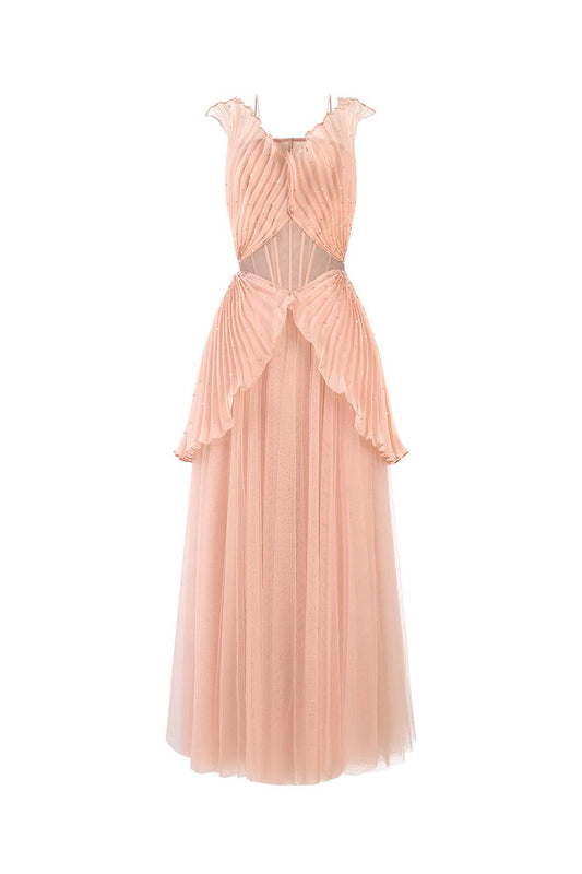
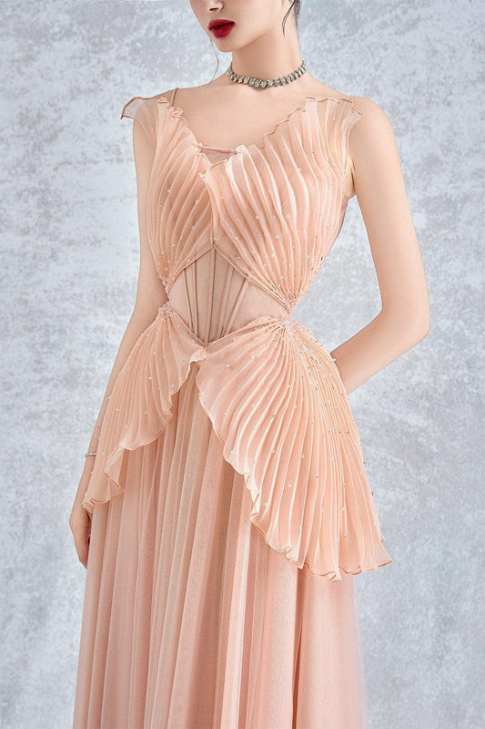
Shop the looks that have this color of the year
Matthieu Blazy Joins Chanel: Ushering a New Era of Creative Excellence
Discover Matthieu Blazy’s appointment as Chanel’s new artistic director, promising a bold...
in
0 comments
Dior’s Bangkok Gold House: A Golden Tribute to Parisian Elegance
Explore Dior’s Gold House in Bangkok—a 1,000-square-metre concept store wrapped in a...
in
0 comments
HOW DOES DONALD TRUMP'S RE-ELECTION AS U.S. PRESIDENT IMPACT THE FASHION INDUSTRY?
Discover the potential impact of Donald Trump's re-election on the global fashion...
in
0 comments


